
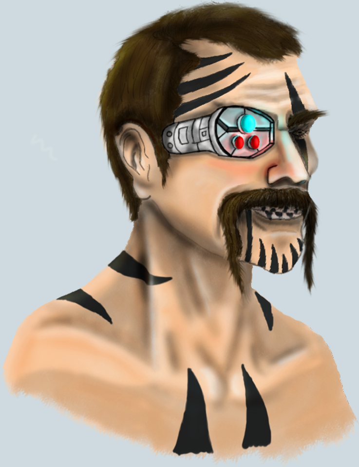
To begin with, the style of art chosen was based on the television show ‘Archer’ which features thick lines, bright colours and overly enhanced masculine boldily features. I developed this style into my own by adding more realistic features. These features made the concept more pleasing and more interesting to look at.
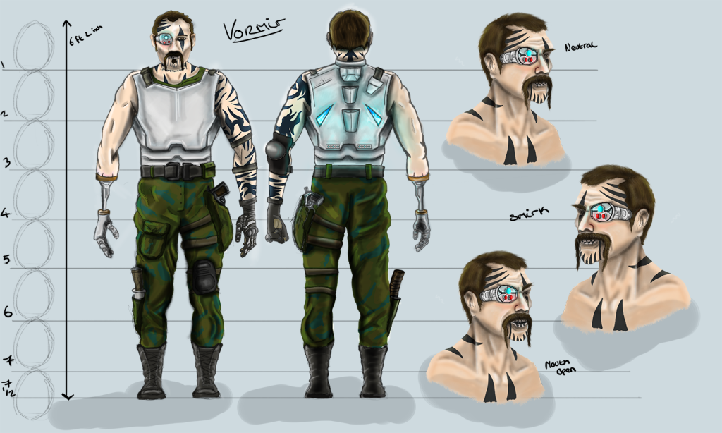
I first looked at the proportions of the human anatomy so I could create a realistic and well ratiod human body. I learnt within Hart’s book, that when drawing a male body, the standardised size would be the length of the head multiplied 7.5 times. In order to develop the width of the character, Hart distinguishes that the body should be three heads wide with a general triangle shape to the body – the shoulders being the widest part of the body.
I then developed a mannequin with minimal features, editing until I was happy with the overall shape of the anatomy. I sketched further over this, adding distinguishing lines and shapes and building the overall structure of the body.
I then looked at reference images of characters, aiming to develop a well-constructed character within the correct genre. The genre I chose consisted of a military style Science Fiction male with both menacing and mechanical features. I also wanted a rugged and European look and so I tailored the angular bone structure to create this. I looked at generalised stereotypes for this character to inspire hairstyles, clothing and bodily structure.
Once the sketch was drawn and I was happy with the outcome, I added detail and colour to add depth to the character. The metal arm was added to add intrigue to the character and his backstory. I developed various sketches consisting of a front and back view as well as three bust images from different viewing angles.
I learnt the painting process through watching Aaron Blaise tutorials which I had bought in preparation to extend my own knowledge. He described how to shade, highlight, add texture, paint, layer, use custom brushes to create textures, use layer masks such as colour dodge and multiply. His tutorials detail the key principles of light and shadow using levels of contrast to alter the overall feel to the image. Within the tutorials, he also goes into detail about skin, hair and other human features.
In the future, I would create the character in a larger canvass to allow me access to closer details which would have been beneficial to aspects of the drawing such as the characters face. I would also add more textural features to the armour in order to add a more metallic finish.
Hart, C. (2014) Figure it out! Human Proportions, Drawing with Christopher Hart. Sixth&Spring Books: New York. Published by Carrie Kilmer. Edited by Joy Aquilino.